You've sat through the board deck. Slide 14 is a 5x5 heatmap with red squares in the top-right corner. The CFO asks, "So what does that mean in dollars?" The CISO points to the red square and says, "It's high risk." The CFO nods, but nothing changes. Budget stays flat. Audit findings stay open.
The heatmap fails because it's a categorical abstraction. It tells you a risk is "high" but not what that costs, how likely it is, or what you should do about it. The Loss Exceedance Curve (LEC) fixes that. It's the one chart that turns cyber risk into a financial conversation your board actually understands.
This is the second post in our FAIR deep-dive series. If you haven't read the first on Monte Carlo simulation, start there. But this post stands alone: by the end, you'll know what the LEC is, how to build it, and exactly what to say when you present it to your CFO.
Why the heatmap fails in the boardroom and the LEC doesn't
Heatmaps are designed for prioritization, not decision-making. They compress two dimensions (likelihood and impact) into a single color. But they lose the two things your board cares about: the range of possible losses and the probability of each.
A heatmap might say "ransomware is high risk." The LEC says: "There's a 90% chance we lose less than $2.4 million, a 50% chance we lose more than $800,000, and a 5% chance we lose over $9 million." That's a decision-ready statement.
Boards don't think in red, yellow, and green. They think in dollars, probabilities, and trade-offs. The LEC speaks that language. It answers the three questions every board member asks:
- What's the worst case?
- How likely is it?
- What should we spend to reduce it?
Heatmaps can't answer those. The LEC can. That's why it's the flagship output of FAIR and the artifact your CFO will actually use.
What the LEC is, exactly
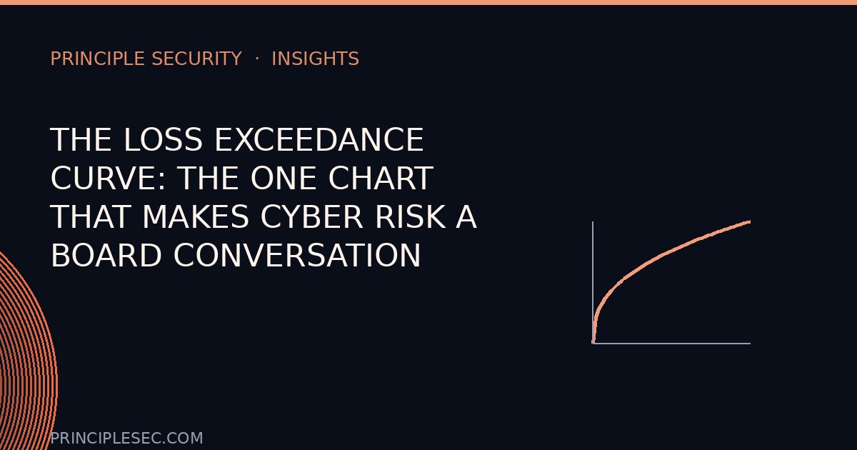
The Loss Exceedance Curve is a plot of every possible loss magnitude against the probability of exceeding it. The X-axis is loss in dollars (or your currency). The Y-axis is the probability that the loss will be greater than that amount.
Think of it as a survival curve for your budget. At any point on the curve, you can read: "There's a P% chance that a loss event will cost more than $X." The curve starts high on the left (small losses are likely) and slopes down to the right (large losses are rare).
It's not a probability density function (PDF), which shows the likelihood of each exact loss. The LEC is the cumulative complement: it shows the tail risk directly. That's what makes it so powerful for boards; it puts the black swan front and center.
Here's a simple way to visualize it. Imagine you have 10,000 simulated loss outcomes from a Monte Carlo run. Sort them from smallest to largest. The 90th percentile is the loss value where 90% of outcomes are below it, meaning there's a 10% chance of exceeding it. Plot those sorted values against their exceedance probabilities, and you have your LEC.
How it's built, from Monte Carlo output
The LEC is a direct output of the Monte Carlo simulation we covered in the first post. If you haven't read it, here's the short version: you model the frequency and magnitude of loss events as probability distributions, then run thousands of iterations to generate a range of possible outcomes.
To build the LEC from that output:
- Run your simulation. You'll have a list of, say, 10,000 annual loss figures, one per iteration.
- Sort the losses. Order them from smallest to largest.
- Calculate exceedance probabilities. For each loss value, the exceedance probability is (number of losses greater than that value) / (total iterations).
- Plot the curve. X-axis = loss amount, Y-axis = exceedance probability. Connect the points.
That's it. The curve is just the sorted simulation output, flipped to show the tail. You can do this in Excel, R, Python, or any FAIR tool. The key is that the curve is grounded in your actual data, not a guess.
If you're using a FAIR tool like RiskLens or a custom script, the LEC is usually generated automatically. But understanding the mechanics helps you explain it to your board and sanity-check the numbers.
Reading it like a CFO: percentiles, mean, and tail
Once you have the curve, you can extract the three numbers that matter for decision-making:
The mean: expected annual loss (EAL)
The mean of all simulated losses is your expected annual loss. It's the average you'd expect to lose each year if you ran the simulation forever. It's not the most likely outcome (that's the mode), but it's the best single number for budgeting. If you set aside the EAL each year, you'd cover your average losses.
The 90th or 95th percentile: value-at-risk (VaR)
The 90th percentile loss is the value that 90% of outcomes fall below. In finance, this is called value-at-risk. It answers: "What's the loss we'd exceed only 10% of the time?" For a board, this is the number to plan for if you want to be conservative. It's the amount you'd need to have on hand to cover a bad-but-not-catastrophic year.
The tail: beyond the 95th percentile
The tail of the curve (the 99th percentile and beyond) is the black swan. These are the losses that happen once every hundred years (in probability terms). They're rare but devastating. The LEC makes them visible, so you can decide whether to accept, transfer, or mitigate that risk.
Here's how a CFO reads each:
| Metric | Definition | What it tells the board |
|---|---|---|
| Mean (EAL) | Average simulated loss | Expected annual cost of risk |
| 90th percentile (VaR) | Loss exceeded only 10% of the time | Conservative budget for a bad year |
| 99th percentile (Tail) | Loss exceeded only 1% of the time | Catastrophic scenario to insure or mitigate |
These three numbers turn a curve into a decision. The mean tells you what to expect. The VaR tells you what to prepare for. The tail tells you what to fear.
The three numbers to lead with in a board deck
When you present the LEC to your board, don't show the whole curve first. Lead with the three numbers that drive budget decisions.
No heatmap can do that. The mean tells you what to expect; the 90th percentile (VaR) tells you what to prepare for; the tail tells you what to insure.
Here's what each one changes:
1. Expected annual loss (EAL): sets the baseline budget
The EAL is your starting point. It's the amount you should be spending on risk reduction to break even. If your EAL is $2 million and you're spending $500,000 on security, you're underinvesting. If you're spending $3 million, you're overinvesting. The EAL gives you a rational anchor for the security budget.
2. Value-at-risk (VaR): determines capital reserves
The 90th or 95th percentile loss tells you how much you need in reserve to survive a bad year without a liquidity crisis. If your VaR is $5 million, you should have that much in accessible reserves or insurance. This is the number your CFO will care about most; it's a direct input to risk appetite and capital planning.
3. Tail risk: drives insurance and mitigation decisions
The 99th percentile loss is the black swan. If that number is $50 million and your company can't absorb it, you need cyber insurance or a major mitigation investment. The tail tells you whether to transfer the risk or accept it. It's the difference between a board that sleeps well and one that doesn't.
Present these three numbers in a simple table, then walk through the curve. That's the order that gets budget decisions made.
A worked mini-example: ransomware scenario
Let's make this concrete. Imagine a mid-sized manufacturing company. They run a FAIR analysis on a ransomware scenario. The simulation produces 10,000 outcomes. Here's a simplified table of the key percentiles:
| Percentile | Loss amount | Exceedance probability |
|---|---|---|
| 50th | $800,000 | 50% |
| 75th | $1.5 million | 25% |
| 90th | $2.4 million | 10% |
| 95th | $3.8 million | 5% |
| 99th | $9.2 million | 1% |
The mean (EAL) is $1.2 million. The 90th percentile (VaR) is $2.4 million. The 99th percentile (tail) is $9.2 million.
Now, what does this mean for the board?
- They should budget $1.2 million per year for ransomware-related losses (or spend that much on prevention to reduce the EAL).
- They should have $2.4 million in reserve or insurance to cover a 1-in-10-year event.
- They should seriously consider insurance or additional controls to reduce the $9.2 million tail risk.
That's a decision-ready story. No heatmap can do that.
Presenting it: what the CISO should say at each point on the curve
When you present the LEC, don't just show the chart. Walk through it point by point. Here's a script you can adapt:
Start at the left side of the curve (high probability, low loss): "This part of the curve shows the frequent, small losses (phishing emails, minor data breaches). They happen often but cost little. We can handle these with our normal operating budget."
Move to the middle (the mean): "On average, we expect to lose about $1.2 million per year to ransomware-related incidents. That's our expected annual loss. It's the baseline for our security budget."
Point to the 90th percentile: "There's a 10% chance we lose more than $2.4 million in any given year. That's our value-at-risk. We should have this amount in reserve or insurance to avoid a liquidity crunch."
Point to the tail: "And there's a 1% chance we lose over $9 million. That's the black swan. It's rare, but it would be catastrophic. We need to decide whether to accept that risk, buy insurance, or invest in stronger controls."
Then close with the decision: "The question for the board is: what's our risk appetite? If we want to reduce the tail, we need to invest in X. If we're comfortable with the current risk, we can accept it. But now you have the numbers to make that call."
That's the "what can go wrong and how much does it cost" framing. It's direct, financial, and actionable.
Present it right
The 5 slides that get your budget approved
Loss-exceedance-curve templates, a worked ransomware example, and the exact board language that turns a heatmap conversation into a dollar conversation.
Get it free →Your board doesn't need another heatmap. They need a curve that shows them the cost of risk. Give them that, and you'll get the budget you need.